tresbien
GitHubA Rails travel reimbursement application
Overview
Tresbien was the project I was originally hired at the OSU library to work on. By default, OSU uses a system called the Travel Reimbursement Entry System (TRES) to process travel reimbursement requests; an employee who needs to be reimbursed will go to TRES and fill out a really long, complicated webform explaining what the user spent money on. TRES works really well from an administrative standpoint, mainly because it has a really good integration with OSU’s Banner Self Service system. However, it’s confusing enough that it leads to frequent, egregious user error that administrators need to correct.
Here’s a screenshot of what TRES looks like:
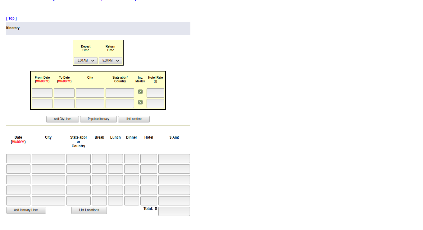
It’s not pretty, it has a mostly tabled-based layout, and it has very few interactive components.
Our goal then was a rebuild of TRES that could accomplish the same level of seamless backend integration while improving the frontend experience enough to significantly reduce user error. Hence the name: “TRES”, but “bien”. We also had to build a review and approval workflow for reimbursement requests, where users selected a “certifier” for their travel reimbursement request and that person could mark the request as either “approved” or “denied”. For our tech stack, we used Rails on the backend with Bootstrap 3 and JQuery on the frontend. This was a stack the library was very familiar with; we assumed it would work well for Tresbien, which turned out to not be entirely true.
My initial project was to build the data model for the project. It looked like this:
- [ ] ReimbursementRequest
  - [ ] has_many TravelCity, TravelItinerary, ExpenseMileage,
        ExpenseAirfare, ExpenseOther, Accounting
  - [ ] has_one claimant (User model)
  - [ ] has_one certifier (User model)
  - [ ] identifier:string(15 character max)
  - [ ] description:text
  - [ ] business_purpose:text
  - [ ] itinerary_total:float (currency) (calculated sum of TravelItinerary)
  - [ ] mileage_total:float (currency) (calculated sum of ExpenseMileage)
  - [ ] airfare_total:float (currency) (calculated sum of ExpenseAirfare)
  - [ ] other_total:float (currency) (calculated sum of ExpenseOther)
  - [ ] accounting_total:float (currency) (calculated sum of Accounting)
  - [ ] grand_total:float (currency) (calculated sum other *_total fields)
  - [ ] claiming_total:float (currency) (user can set this specifically)
- [ ] User
  - [ ] certifier:bool
- [ ] ExpenseType
  - [ ] has_many ExpenseOther
  - [ ] name:String
  - [ ] active:Bool
- [ ] TravelCity
  - [ ] from_date:DateTime
  - [ ] to_date:DateTime
  - [ ] city:string
  - [ ] state:string
  - [ ] include_meals:bool
  - [ ] hotel_rate:string
- [ ] TravelItinerary
  - [ ] date:Datetime
  - [ ] city:string
  - [ ] state:string
  - [ ] break:string
  - [ ] lunch:string
  - [ ] dinner:string
  - [ ] hotel:string
  - [ ] amount:float (currency)
- [ ] ExpenseMileage
  - [ ] from_date:DateTime
  - [ ] to_date:DateTime
  - [ ] from_city:string
  - [ ] from_state:string
  - [ ] to_city:string
  - [ ] to_state:string
  - [ ] miles:int
  - [ ] round_trip:bool
  - [ ] notes:text
  - [ ] amount:float (currency)
- [ ] ExpenseAirfare
  - [ ] from_date:DateTime
  - [ ] to_date:DateTime
  - [ ] from_location:string
  - [ ] to_location:string
  - [ ] notes:text
  - [ ] amount:float (currency)
- [ ] ExpenseOther
  - [ ] has_one ExpenseType
  - [ ] from_date:DateTime
  - [ ] to_date:DateTime
  - [ ] notes:text
  - [ ] amount:float (currency)
- [ ] Accounting
  - [ ] index:string
  - [ ] fund:string
  - [ ] organization:string
  - [ ] account:string
  - [ ] program:string
  - [ ] activity:string
  - [ ] amount:float (currency)
(You can find the original issue here)
I would describe it as dense but not complicated. The core of the data model is the reimbursement_request model, which has_many of the other models. Using Rails ActiveRecord, this was pretty simple; once I had the migration syntax figured out and created the first two or so models, the rest was mostly copy-and-paste.
My next project was copying the old layout of TRES into a new Bootstrap form. I used Rails SimpleForm, which made the process pretty quick once I had learned the tool. At this point, the application had no dynamic behavior and was just a prettier version of the old TRES.
The next step, then, was the start adding functionality. We went back to basics, studying TRES business logic to find places where we could eliminate redundancy in the form. Sure enough, we found it: TRES has a concept of “Travel Cities” and “Travel Itineraries”, where the content of “Travel Cities” can be used to populate itinerary fields. This let us simplify the form to the point that a user could fill out which cities they visited, their per diem rates for those cities, and have the individual days for those cities automatically populated. We also built in code to automatically check if invalid data had been entered by highlighting bad fields in red. Pretty basic stuff, but a major improvement over the old form.
This ended up being a pretty heavy lift; we had to write a bunch of custom code to track the application state as the user filled out fields, and JQuery was not quite up to the task. Integrating MobX with webpack helped, but we universally agreed that starting with a framework like React would have saved us a lot of work in the long run.
At the same I also did some work on the display modes for completed reimbursement requests; we needed a web-friendly mode that could also be printed, and the ability to convert reimbursement requests into PDFs. I used Wicked PDF the last part, which saved us a lot of manual work.
The state of the project when I left was a sort of polished-draft: most of the needed functionality existed, and there weren’t any major outstanding issues. There are areas where I think we could’ve done better; if you look at the screenshots below, you’ll that the main form is really dense, and we had to rely on text to convey information that we might have been able to build into the form with more time. Overall though, I think we did a good job of replacing existing functionality in TRES and improving its usability. Implementation is currently pending an integration with the Banner system.
Screenshots
The Home Screen
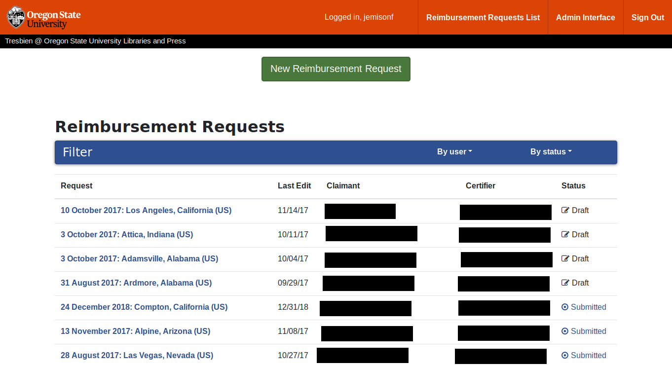
This is what a logged in user sees at the base of the application. A regular user will see all of their reimbursement requests, an approver will see their requests and requests assigned to them, and an admin will see all reimbursement requests.
The Main Form
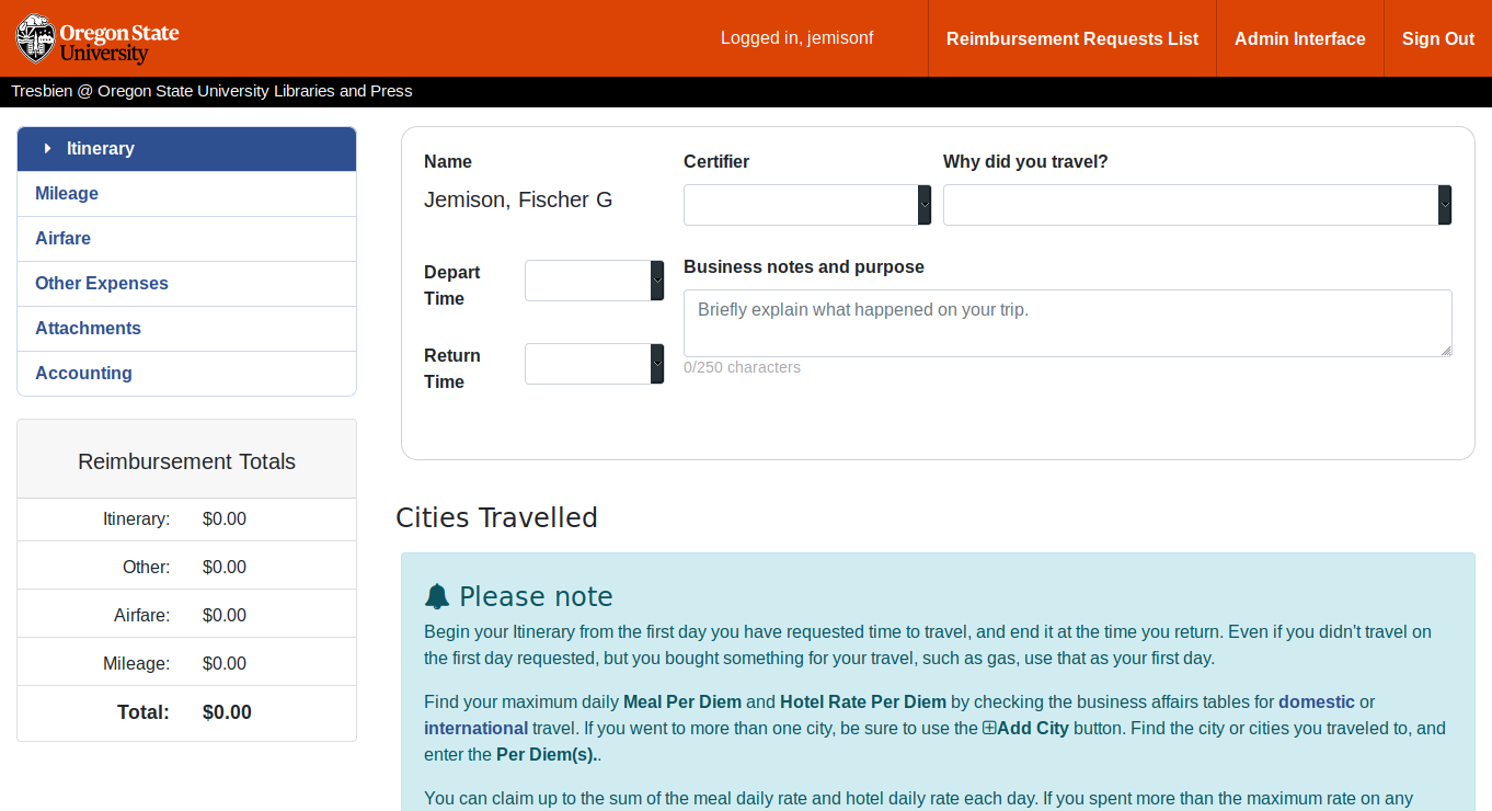
This is what you see when you click the green “New Reimbursement Request” button in the previous screen. The left sidebar shows current reimbursement request totals, and you can use the tabs to switch between different screens. The box at the top has global request information and is shown on each tab.
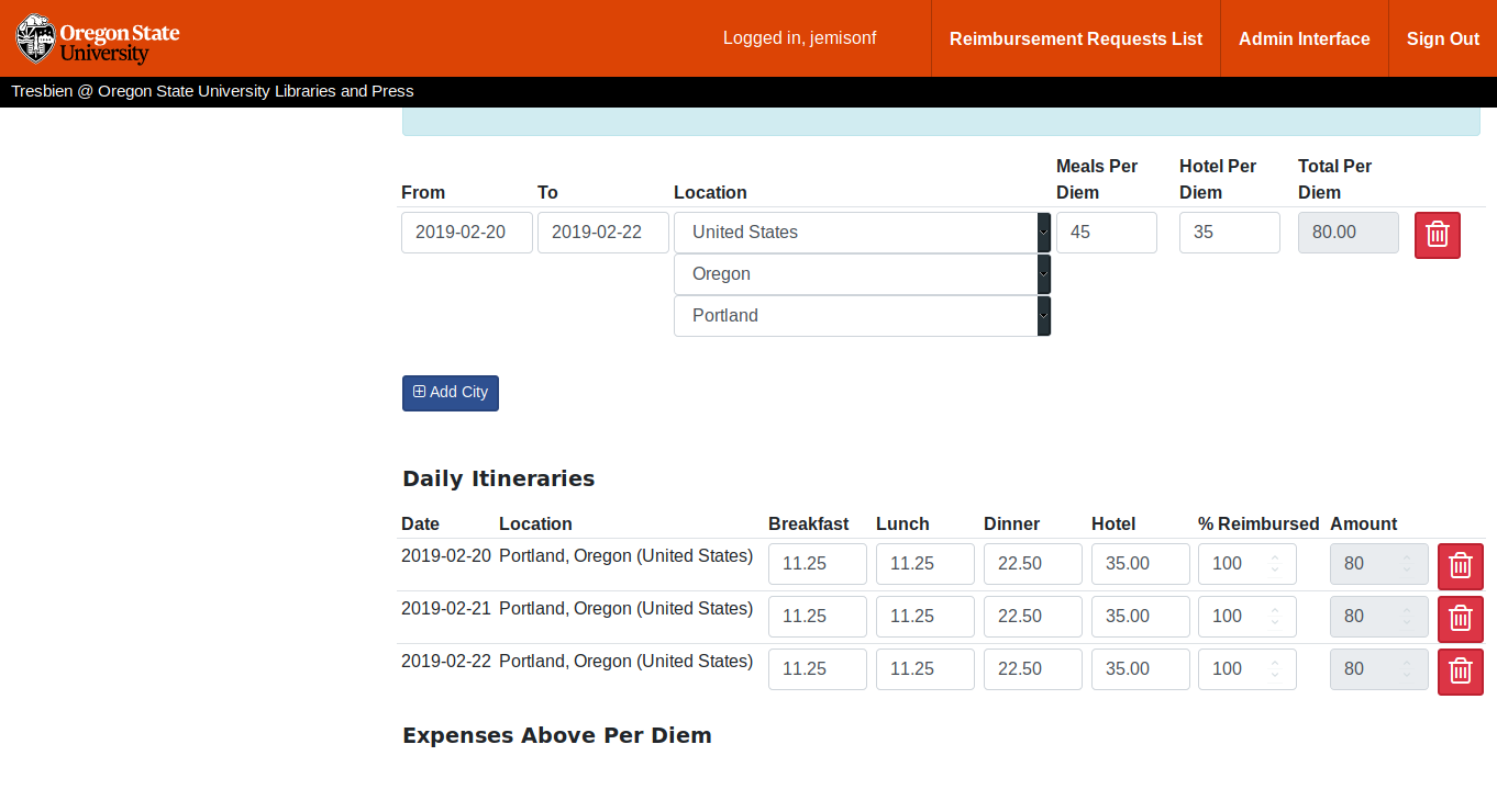
This is what the “Travel Cities” and “Travel Itineraries” view looks like. The user in this screen has filled out a “Travel City”–Portland, OR from Feb 20th to Feb 22nd–and used it to generate three “Daily Itineraries”.
Viewing Completed Requests
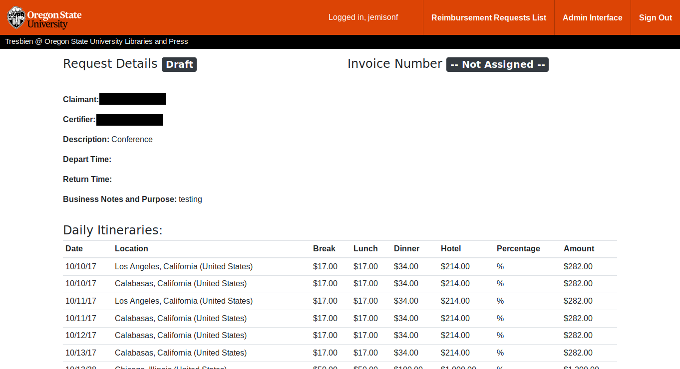
This is a basic overview of what a completed form looks like when viewed by a user. The bottom of the page has a button that an approver can use to approve or deny a request.